Saturday, 27 October 2012

'Apophenia' at Foodface

 Friday 26th October, 2012 (one night)

With paintings by Lindsey Bull, Maria Högbacke, Tom Howse, Phoebe Mitchell, Joanna Phelps, Charles Robinson, Lucy Smallbone and Mimei Thompson


Foodface just captured my heart tonight. At the back of an industrial park, at the back of Peckham, and at the end of a dark alley and an even darker courtyard, I never expected to find such delicacy, sensitivity and lightness of touch. Apophenia presented the work of eight emerging artists, each contributing one small canvas to the show, curated by Phoebe Mitchell and Charles Robinson (who also showed work).

The paintings were unified not through theme or formal content, but by a mutual adoration of surface, brushstrokes and colour. No, I couldn’t place any social content, but for me the very gentleness of their gestures felt refreshing, generous and powerful. I can’t help but guess that the scale of everything helped engender in me this response. The paintings brought you close to them, then seduced you with wet strokes of paint and thick impastos, yet held your attention in a quiet way.

I would advise you to go see it, but it was ever so sadly a one night occurrence, the gallery to be converted back to a work space again immediately after. 

At the end of a cold night this place warmed the part of my soul dedicated to the appreciation of the understated and the insubstantial. Small yet moving. 


Charles Robinson, Communion (2011) oil on canvas,  30 x 26 in

Phoebe Mitchell, Untitled (Harlequin) (2012) Oil on board, 40 x 30 cm

Lucy Smallbone, Panel (2011) Acrylic and collage on board, 30 x 20 cm

Lindsey Bull, Accretion (2011) oil on board, 36  x  30 cm


Joanna Phelps, Trapeze (2009) oil on canvas, 30 x 25 cm
Detail of Mimei Thompson's Untitled Cave Painting (1) (2011) oil on canvas, 61 x 76 cm


Tom Howse, Earth Time (2012), oil and canvas on board, 15 x 10 cm


Thursday, 25 October 2012

Bjarne Melgaard at ICA


25 September - 18 November
Exterior of ICA
A House to Die In
Institute of Contemporary Art
www.ica.org.uk

On Saturday I came to the ICA for Art Licks’ Second Annual and a friend suggested we come early to see the current exhibition. Quick research revealed the present show to be the first UK solo exhibit of New York-based Norwegian artist Bjarne Melgaard. It was entitled ‘A house to Die In’  -  I was not too enthused. On these grey, misty autumn days in late October, when the sun becomes more scarce and the cold takes on a new bite, I’m not actively seeking out depressive sounding things.

But in some ways the title is a bit of a red herring. All the work in the exhibition was produced in collaboration with others. And if there’s one characteristic or saving grace of collaboration, it’s that it really is the opposite of a death wish and generally ‘fruitful’, ‘invigorating’, or at least healthily infuriating. 

Lower Gallery with façade visible on right.
Upper Gallery
The exhibition is split between the Lower Gallery, a collaboration with architectural firm Snøhetta showing the exterior of said house, and two rooms of paintings and sculptures in the Upper Gallery, which is the proposed ‘interior’. The walls of the upper space have been painted safety-vest orange, and are filled with large paintings, and small, quirky sculptures of human and animal figures (as well as some large shapely black seating, again a collaboration with the architects). All of the painting and sculpture is produced in collaboration with non-art world artists, their names featured prominently under each work. The space, with its bright colours, rumpled carpet floor, and heavily expressive painting is indeed homey, if not a bit jarring and over-stimulating.  


The Lower Gallery, which has been painted metallic blue, is dominated by a life-sized angular black façade and is surrounded by several tables filled with drawings, models and objects. On one table there sits a miniature architectural model (the ‘house to die in’) and scattered e-mail correspondence between the artist and Snøhetta concerning the practical details of the exhibition (colour of paint for the walls, etc.).  In addition, there are sketches and phrases handwritten in black capitals giving some narrative to the work displayed (‘Concept –house to commit suicide in, house to die inside, house for not living’). Other surfaces are filled with more geometric models and sketches for architectural ideas as well as some drug paraphernalia, including crack pipes with a musing note from the artist about whether their glass shape can maybe be re-interpreted as windows for the house (!).

Architectural model of 'House to Die In'.

Notes and drawings surrounding the model. 

Correspondence with architects. 

Various objects and crack pipes.

Completing this scene, and surprisingly adding an effective punch of decorative colour, are custom-made rugs by the artist (the same as are found in the upper gallery), loosely fitted to the floor and bunched up against the walls.

So is this serious, sincere work about death, depression and mental illness, or removed and distanced commentary about something else?

Indeed, the black mock-façade is a bit dark, but falls short in sinister content and is inherently un-scary in the way Hollywood sets of the evil lair of the villain become corny and harmless seen out of the influence of lighting, special effects and clever camera angles. The paintings are exuberant, reminding me of typically expressive ‘troubled artist’ paintings, but the presence of interior decoration items and bold colour schemes makes it feel more like the quirky house of a rich collector.


I keep wondering what I’m supposed to think about the apparently dark and depressing angle of the exhibition. And the more I think about it, the more it seems that this exhibition revolves around a question of sincerity and faith. Especially faith in what the artist has chosen to tell us about his process, as these details are so integral to interpreting the work.

Concerning the collaboration with non-art world artists (I take this to mean un-educated), the press release describes how Melgaard created the paintings and sculptures ‘in partnership with a group of artists who have no formal art education and little or no connection to the art world’. But beyond the little gem of information that several of these collaborators: ‘are in recovery, face mental or emotional challenges, or suffer from schizophrenia’, not much detail is given about the process. On hearing this, my first response is ‘I beg your pardon??’ It seems like a lot of loaded information, the details of which I would suggest are pivotal to reading the work.  

The paintings that adorn the walls of the Upper Gallery (the so-imagined interior of the House to Die In) can best be described as energetic, colourful, dynamic, at times discordant and charmingly amateur, or at worst as slick, cynical, knowing, hip, ‘bad’ painting painting. I could interpret this as Melgaard bringing to light one of the important concerns in contemporary art: questioning authorship, and the value of the hand of the artist. There is also some mention of blurring the lines between art and architecture, in regards to the collaboration with Snøhetta. 

In this case it could be a critique of the modernist artist who is the sole creator, part of an extra-elite group which determines culture. An important thing to be questioned, no doubt, but it gets tricky when you realize that this work looks eerily like what many art-schooled artists are actually trying to create.

What’s notable about so-called ‘bad’ painting and the like is the fact that it very carefully and automatically polices the line between it and ‘outsider’ art. And differences definitely exist between the two groups, if only in the education, pedigree and awareness by the artist of their work within a larger context and history of art. One group is charmingly entertaining, although ignored; the other is obnoxious and provocative in the most uninteresting way, but not lacking in critical attention. Elitist and knowing ‘bad’ taste is to me quite unforgivable. I think it is about playing a joke at the expense of others and reveals the class system that underpins its aggressive, yet banal wit. I’ve always suspected that ‘bad’ painting held part of its allure for artists because of the element of selling to the rich what they secretly abhorred.

The question that has to be asked of Melgaard is about the nature and results of this collaboration. Is he honouring his collaborators, or is he profiting off a desire to see their wonderfully strong, 'wounded' sincerity? (the ‘purity’ of which I imagine would be impossible to replicate).


The funny thing is that he puts down their names, seemingly supporting their individuality and artistic prerogative, but clearly the familiarity and un-originality of the work will undermine this. Is he making a joke? None of these paintings would achieve any attention if it were not for Melgaard’s  incorporation of them into his own work.

This exhibition raised more questions than it answered. There are plenty of interesting things to look at, but behind the aesthetic content I found that this work was actually about ethical judgements, and I became quite unsure of my position within this game.

This is a timely show that in my mind addresses and reflects the difficulty contemporary artists have with sincerity, and the insecurity that flows from that. Do we 'know' so much that sincerity becomes impossible? The old canons are dead, the old ways of doing things no longer appear suitable, however there continues to be a desire for old pleasures. Amongst it all there is still that familiar energy to make and create, but what does one do with it in a world seemingly devoid of noble purposes?

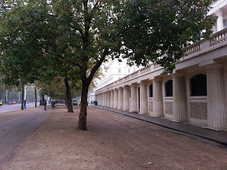
Trafalgar Square as night falls.


Friday, 19 October 2012

Carracci & Freud at Ordovas

5 October – 15 December

Painting from Life
Carracci Freud
Ordovas (in collaboration with Dulwich Picture Gallery)
25 Savile Row, London

Looking in at the exhibition 
This is a small exhibition of work consisting of six small portraits by Lucian Freud and three similarly-sized portraits by Annibale Carracci. I was really struck by this exhibition, and impressed by its frank historicity, painterly achievement and skill. No irony here. ‘Simple’ straightforward portraits where the details matter and the subtleties are considered.

The gallery has tried to create some comparisons between the works of the two artists, such as Freud’s portrait of Frank Auerbach (1975-76) where the sitter is older and looking downwards, and a Carracci portrait of an old balding man from the side (entitled ‘Head of an Old Man’ c.1590-92 – see no irony here whatsoever!). The face of an old woman painted by Carracci and three portraits of Freud’s mother fill another wall of the exhibition.

(Exhibition image from http://www.ordovasart.com)
You want to stand close to these, and the guard will warn you off, but it’s an intimate distance you want to achieve. Like being close enough to study every inch of the face of your dearest, you want to lose yourself in the intensity of looking. Or perhaps I should amend that. In these paintings there is such intimacy and intense familiarity and looking, that they can become entirely detail in a way that makes it almost impossible to see the overall whole. Like very close friends, whose faces we know so well, that they risk becoming almost invisible to us.

L: Lucian Freud Frank Auerbach, oil on canvas, 1975-76
R: Annibale Carracci Head of an Old Man, oil on canvas, c.1590-92

These are old paintings of old people, a subject often considered (by harsh contemporary standards anyway) as irrelevant and perhaps even grotesque. But it is expressly the age of these subjects that inspires such beautiful, strong and capable use of paint; qualities that I think reflexively reveal something about the sitters themselves. Carracci’s style is looser, more confident, with warmer tones. Freud is more obsessive, harsher, obviously laboured (but no less impressive), with so many layers of paint, that it, at times, overtakes the ‘person’.

There is a lot of sadness in these faces, but perhaps the emotion I'm seeing is more complex. These are all older faces, and I imagine their particular expressions and fascinating irregularities are the result of sitting long enough to have relaxed into their ‘natural’ expression, which after many years is invariably one of sorrow.
Here I see the worth of painting, or at least one of its worthy causes: recording our looking at others, and registering our desire to get closer. Perhaps these paintings even hint at a yearning to actually feel the skin of the other person, to be inside of another’s reality. But there is a point, and it becomes clear with Freud, that it can be possible to look with such forcefulness, that the person in front of us disappears into abstraction.

I have the sense that we don’t look like this anymore. This is impressive detail without high definition. It gives more ‘information’ than the highest resolution camera, and shows our capability for seeing. Yet it also reveals what we care to see, what we care about, and our struggles to see through familiarity.

Much has been written about both artists before and I shall not add to those histories here. But today, as I walk through London, it reminds me to take the time and energy to actually see what I'm looking at. 

Street view of gallery

Tuesday, 16 October 2012

Peter Doig at Michael Werner Gallery


27 September - 22 December

New Paintings
Michael Werner Gallery, Mayfair
22 Upper Brook Street
www.michaelwerner.com

I've come up the heavy dark oak staircase, after pushing through a heavy dark alarmed and ornamented metal door, and in this transformed old Mayfair mansion I hear the soft accent of a dealer telling some collectors: ‘Oh, there’s smaller ones upstairs’. Clever, I think, this blonde, congenial guy is really business-minded.


It’s a gorgeous early autumn morning in London and warm sunlight comes streaming in through large floor-to-ceiling windows. But I'm feeling absolutely cold and numbed by the paintings. What were they about? I'm hard pressed to describe a direction or tone to the work, besides the fact that it seemed focused on a sense of line, shape, colour and repetition of motifs. These are, however, formalist qualities, and what I've always valued about Doig in the past has been the fact that the paintings have surpassed ‘mere’ technical proficiency and felt more significant, more full with emotion and revealing of profound symbolisms, even possessing an otherworldly quality.


Where are the guts, the heavy atmospheres, the sense of being able to feel the very air of the scene? I long to be able to step into these scenes of strange nostalgia, entranced by the heady sense of place. There is a meandering use of painterly skill in composition and shape here, but these works lack conviction, urgency and mysticism.

I guess with great painters come great expectations. And why not? If you believe that art matters to the world, then we have to be severely disappointed when confronted with evidence to the contrary. 


Smaller works on paper in upstairs space

Thursday, 11 October 2012

João Onofre - Cristina Guerra Contemporary Art

28 September - 7 November 2012
Rua de Santo António à Estrela
Lisbon, Portugal 

Note: I've had the good fortune to be catching some sun in Portugal these last two weeks, and, although this is a 'London' blog, I really wanted to write about this show and my experience in the city.

In Portugal tonight they’re protesting. The students, in their  traditional black suits and coats have taken to the main square in Praço do Rossio  to make noise about the ‘crisis’ that has overtaken their country. In a fountain of spurting classical goddesses and jumping fish, one student has taken off his clothes and is swimming in the shallow pool. People exclaim excitedly as he poses and struts in his now wet and see-through underwear, and to the encouragement of his peers, he pulls them down to show his rosy bum cheeks. The chants of protesters fill the historic square, and young adolescent energy pulsates. Another group now joins from the north.


Praço do Rossio
In the fountain at Rossio


I continue on across Lisbon, under the bubble-gum pink skies of early evening, to Cristina Guerra Contemporary Art.  The route is full of hilly ups and downs, and roughly hewn bricks of white sandstone pave the way. As I arrive at the gallery the sun has set. I've already been seduced by the beauty and nostalgia of the city, and it’s a fitting moment to encounter João Onofre's work.

Lisbon as the sun sets

The large main gallery space has been painted entirely black and a projection fills one wall. The film, entitled GHOST (2009-2012), begins with a shot of the Tagus River, complete with blue water, clear blue sky and a horizontal greenish blue swath of trees, buildings and whatever else makes up the river bank. The spiky top of a lone palm enters the shot, and then we see it’s on a tiny sandy island. It seems to be both propelled forward and drawn down the river, pushing itself towards the open ocean like the great Portuguese ships that once embarked down this same grand corridor towards the great unknown.


There is only minimal sound on the video, ambient noise. Then, as the palm gets nearer to Ponte 25 Abril, you hear the hum of the traffic and the soft wailing of thousands of wheels against metal, rising up almost imperceptibly and then augmented by low harmonies.  There is a sense of opening sonic potential. However, as the palm passes the bridge, quiet quickly descends, and the heavy intonations grow suddenly distant.

The water shimmers like deep blue sequins, while gigantic ships watch placidly from the sunny banks. The land diminishes, the bridge is now farther away, this journey seems slow, but I sense that many parts are missing. There is one last shot of the shoreline, this time we see industrial silos and tanks, quiet and motionless, presumably unused or underused. Now the hum returns, slowly and imperceptibly building, like a choir of muted voices from a far-away monastery. The shoreline gets even more minimal, except for a few tassels of trees, and then, disappears into ocean. The projected sky grows, orangey and burnt, the water becomes more navy, and the palm is now a wisp, a smudge on the immensity of the horizon. Always with its hair back, always against the wind, and then, finally, darkness.

In the lower gallery, a conventional white cube, there hang three clusters of photographs of the same small, bizarrely out-of-place looking island. In the first grouping, the sky is such a deep fresh blue, we know that it is from earlier in the day, at the beginning of the palms ‘journey’.

Lower space 

There is a moment where I find myself thinking back to the video, comparing these ‘documentary’ images to my remembrance of the pseudo ‘event’. I discover new details in the background or foreground around the always-central palm: a old column from the bank of Praça do Comércio, a bit of a historic building, a different angle of the red bridge. The final group of images are mostly sky, beautiful end-of-day shots of blushing sunsets and lowering blue of the night sky.  The golden beige of the mini-island contrasts with the blue river, and the single palm stands elegantly upon its sandy pedestal with silhouetted sweeps of green it is a most benign disturbance to the seascape.

These are deeply sentimental pictures.  Postcards for paradise.  They bring to mind iconic images of palms, of Florida, of vacation brochures, of cheesy t-shirts and the shorthand that this tree has become for lonely desert islands and tropical leisure. It is hard not to get swept up in docilely selecting which one you would chose to remember your ‘vacation’ by.  I think that it is in this reaction, this act of remembering the original that never was (that is, never personally experienced), this process of recounting, comparing, revisiting, and activating uncertain memories, that the artist wants to engage us in. I am very drawn to the images and they comfort me in an intangibly familiar way. 

However, I think the potential of the work depends on the viewer having some discomfort with the beauty of the scene; otherwise it could be very easy to just relax and enjoy the ride, so what if the pictures are not quite the same?  The repetition of the motif of the tree and the focus on the singular object seem to negate the background landscapes, although they are always changing to glorious effect. It’s the idea of that lone romantic tree that stays with me, and beguiles. I am left considering less the meaning of this specific tree that once travelled the Tagus River, and more why it provokes in me such fantasies of romantic isolation, beautiful untouched nature and the exhilaration of the journey into the unknown. 

I suspect that the in its rare and delicate nature, this palm is as achingly unique and sensitive as our sense of selves. Through the ever-surveilling lens, we, along with the camera, trace the palm’s path and marvel at its exotic nature. We mirror our lonely hearts with its singular beauty; it becomes the object of our affection which we long for, and the focus of a sweet melancholy that nourishes our sad hearts. I can't help but think of Fado, and its expression of 'saudade'.  Indeed this slender arching tree with its exquisite windswept fronds is the sort of object you only yearn for from afar, an obsession at a distance that the lenses of cameras are so good at exposing.


So what does this work reveal? Of what does it speak? I see it as dramatizing the conditions of romance as tied to the observation of beauty that our culture so loves to reproduce in cinema, film and images. I see the tree as metaphorical of the ‘view of the other’, seen only through oneself and which is in fact a construction of oneself. This is familiar scenario where the artist is the master-creator, heroically procuring a thing (in this case a palm all the way from Madeira) that becomes symbolic of our desire for the other, and builds the conditions from which to view it from a safe and controlled distance. Does the artist intend for us to become aware of this charged position of looking?

I think there is the desire to create a seamless illusion of a reality that could have been, and to introduce this mnemonic precariousness into the mind of the viewer with the apparition of such an unusual in such an unusual place. And in the photographs in the lower gallery space, my imaginative longing is indeed so capably held by the impeccable illusion.  However, the view of this idyllic scene proves more difficult to control in the video, where the daydream is less seamless, and the shape of the island caught in the low shadow of afternoon sun hints at the boat that no doubt propels it.  This is either incidental or unimportant though, because it is the idea of the lone palm that we’re all looking at.

But beyond this, I see the real substance of the video as a dramatization of the fixated looking, the yearning, the ‘beautiful’ isolation, and the ‘loving’ surveillance that constitute the dominate visual narratives of ‘romance’ in society.

I took a lot of pleasure from the hauntingly minimal sounds of the video, and the crisp simplicity of the pictures, full of the stunning azures and roses that bless the Lisbon sky. The artist gives us so much to look at, and a fitting object on which to fix our emotions, but was it perhaps at the expense of confronting how romanticism and exoticness can be employed to sustain our own egotistic position as looker?

Issues to do with documentary versus fiction and sense of time and remembrance are interesting to consider, especially with the presentation of photos. However I think there is a temptation to focus on the physical characteristics of the work, from the type of palm to the background scenery, and gloss over the more fundamental conditions of viewing which the artist has so carefully created. This work brought up difficult questions for me about our expectations of beauty and the tricky moral and mental positions we occupy when viewing the world as both an expression of our inner selves, and existing only for our enjoyment (or sorrow, as the case may be).